 "Anon" (tjsielsistneb)
08/15/2015 at 00:32 • Filed to: None
 2
2
 18
18|
"Anon" (tjsielsistneb)
08/15/2015 at 00:32 • Filed to: None | 2
| 18 |
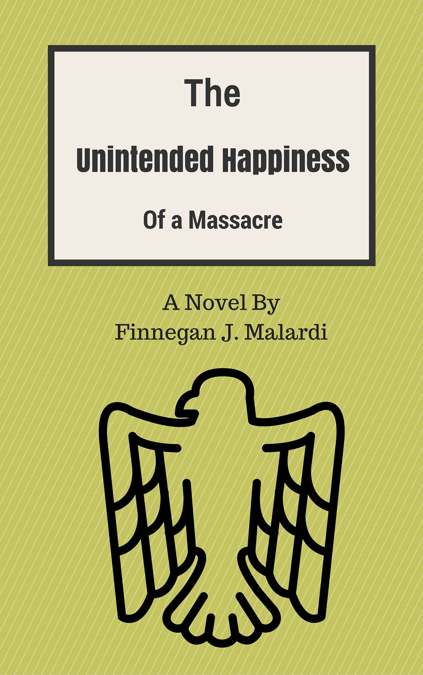
I’m going to begin writing on Wattpad soon and need a book cover, would this cover make you want to click on my story and see what it’s about? It’s about a seventeen year old boy named Ian traveling across a war torn country searching for an author who nobody knows what happened to. The war was a religious war (think a modern day crusade, just with modern weaponry). He travels from town to town on an old beat to hell Moto Guzzi motorcycle finding bits and pieces of what happened to the author. Each town has it’s own culture and customs that the boy experiences, from festivals to funerals. What do you think?
 CB
> Anon
CB
> Anon
08/15/2015 at 00:39 |
|
I think the layout of the font needs some work. Spacing and sizing is off.
 BReLp7dzHM3ytYsE
> Anon
BReLp7dzHM3ytYsE
> Anon
08/15/2015 at 00:41 |
|
Go with one font style.
 Berang
> Anon
Berang
> Anon
08/15/2015 at 00:48 |
|
Get rid of “a massacre” and just call it The Unintended Happiness of a Novel by Finnegan J. Malardi.
Also make sure every society he visits in abominably stupid and an actual society that exists today. This could be the Candide of our time.
 Bandit
> Anon
Bandit
> Anon
08/15/2015 at 00:53 |
|
I like the title. I’m sure the bird has some significance to the story and it is a nice outline. The biggest issue is probably the vertical spacing of the main title, right now my eyes get trapped in the white space between “The” and “Unintended Happiness.” I for one am okay with the contrast between the Sans-serif and serif fonts, but there needs to be a greater size difference to make it flow better. Just my $.02
 PowderHound
> Anon
PowderHound
> Anon
08/15/2015 at 01:13 |
|
“Of a massacre” doesn't read right. Seems more like a subtitle. The spacing like everyone said, makes it difficult. Tighten it up and leave some white space.
 Shoop
> Anon
Shoop
> Anon
08/15/2015 at 01:50 |
|
Too many different fonta
|
Anon
> CB
08/15/2015 at 01:55 |
|

How about this? The font was a common complaint!
|
Anon
> BReLp7dzHM3ytYsE
08/15/2015 at 01:56 |
|

How about this?
|
Anon
> PowderHound
08/15/2015 at 01:56 |
|

How about now?
|
Anon
> Shoop
08/15/2015 at 01:57 |
|

Better?
|
Anon
> Bandit
08/15/2015 at 01:59 |
|
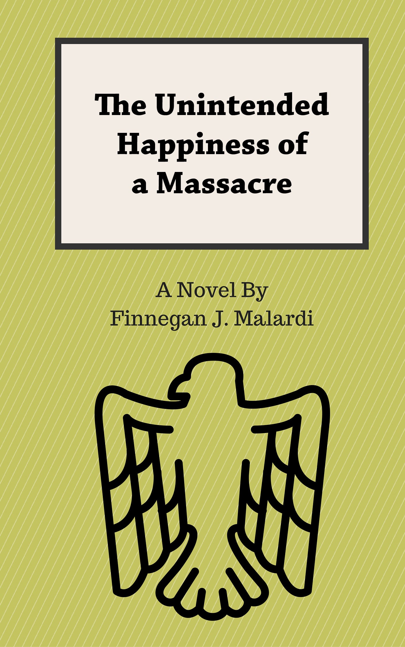
Thanks for the input. The bird is important, it’s on a specific country’s flag in the story. I’m thinking about going with a single font for the title due to several people complaining about it. What do you think about this?
 sebdel
> Anon
sebdel
> Anon
08/15/2015 at 03:01 |
|
It looks as an old book cover, wich is good if you’re going for that look, but it can cause some people to loose atention if they’re looking at some thumbnails on a ebook site.
I like this “It’s about a seventeen year old boy named Ian traveling across a war torn country searching for an author who nobody knows what happened to.” sounds interesting, also the part about the towns and cultures. I think there’s a better title for that plot, the “massacre” mentioned in the title makes it sound like a zombie story, but your description of the plot seems deeper than that.
Also this being oppo, change that guzzi for a rusty saab
 That Bastard Kurtis - An Attempt to Standardize My Username Across Platforms
> Anon
That Bastard Kurtis - An Attempt to Standardize My Username Across Platforms
> Anon
08/15/2015 at 08:53 |
|
I love it, actually. I’m big on kinda minimalist, old-school looking books. The color is good, the stripes are good. Also, I really like the ‘of a massacre’ being smaller. Your eye is drawn to ‘The Unintended Happiness’, and the last thing you expect after that is ‘of a massacre’. It’s a book I would, at the very least, pick up and see what it’s about...which if you’re working on the look of the book, is really all you can ask for.
|
Berang
> Anon
08/15/2015 at 09:15 |
|
Change The to An in the title. It’s less definitive and both more inviting and suspenseful.
Also the bird should be facing the other way.
|
BReLp7dzHM3ytYsE
> Anon
08/15/2015 at 09:57 |
|
Much better.
|
PowderHound
> Anon
08/15/2015 at 11:32 |
|
Pretty damn good. Personally I would take that and play with spacing for probably an absurd amount of time and see if there were any other ways it may work better. But that's all trial and error stuff waiting to see if some sort of aha moment comes through
|
Shoop
> Anon
08/15/2015 at 12:56 |
|
Muuuuuuch better. It no longer looks like a church newsletter.
Thouugh the title does make it sound like an expose on Toyota’s unintended acceleration problem lol
 ptak appreciates old racecars
> Anon
ptak appreciates old racecars
> Anon
08/16/2015 at 08:46 |
|
Cover looks okay now (the revised version), I’m interested in the story though. Any info on where I can buy it when it’s done?